Fallen Gravity: Turning Orbital Data Into Music and Art
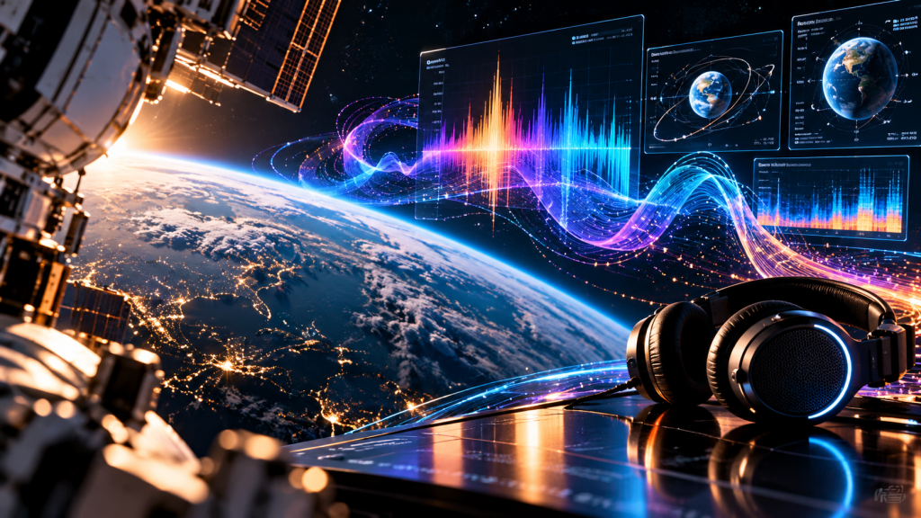
Fallen Gravity sits at the intersection of digital art, sound, and the mythology of orbit. Public accounts connected the project with artist Mad Dog Jones, experience agency INVNT, and Artemis Music Entertainment. Its use of space-related data raises a useful question: when numbers are turned into a composition, what exactly are we hearing?
The project as a creative collaboration
Fallen Gravity was presented as an art and music experience with the International Space Station as an important reference point. The participating organizations brought different kinds of expertise to the concept, from visual aesthetics to production and space-linked storytelling. Describing that collaboration is more accurate than suggesting one artist independently built an orbital technology system.
The work belongs to a period when digital editions, audiovisual installations, and new distribution platforms encouraged artists to make the production process part of the narrative. In that context, a technical connection to space could be both a source of material and a means of framing the work for audiences.
What data sonification actually means
Sonification assigns audible properties to information. A changing numerical value might influence pitch; a repeating event might determine rhythm; a second variable might control timbre or loudness. The mapping is chosen by a composer or software designer. The sound is therefore an interpretation of the data, not an acoustic recording of orbital motion.
That difference does not make the music less meaningful. Musical instruments are also systems for transforming physical actions into sound. Sonification simply adds an explicit layer between measurement and perception. Our introduction to data sonification explains the method in more detail.
Why orbital measurements invite composition
An orbit has repeating patterns: position changes over time, periods recur, and measured values can vary across a spacecraft’s path. These patterns can supply structure for a composition. A designer might treat a completed orbit as a musical cycle or use a changing measurement to shape a melody.
But the chosen scale matters. Compressing ninety minutes of measurements into a short passage changes how listeners perceive the pattern. Normalizing values into a narrow pitch range changes it again. Any explanation of a data-driven work should identify such choices when they are known and avoid claiming that the composition is a direct translation free from artistic intervention.
The role of the visual artist
Mad Dog Jones is associated with a visual language of saturated color, cinematic environments, and digital-era nostalgia. In a collaborative project, visual design can give abstract data an emotional setting. Imagery may suggest speed, depth, isolation, or a futuristic atmosphere even when those qualities are not properties of the dataset itself.
This is a strength of art, not a scientific flaw. The problem arises only when descriptive language blurs the difference between aesthetic suggestion and measurement. An image of a spacecraft in dramatic light can communicate a mood while still being an imaginative representation.
Sound, time, and audience attention
A listener rarely knows the underlying values while hearing a sonification. Composers therefore decide whether to provide a key, a visualization, or an explanatory note. Without that context, an audience may hear an interesting piece of electronic music but miss the relationship to the source material.
Exhibitions can address this by showing the data moving alongside the sound or by letting visitors alter the mapping. Such choices make the translation process visible. They also reveal that another designer could create a very different composition from the same measurements.
Space art and the evidence question
Space-connected projects sometimes combine confirmed technical elements with promotional language that is harder to verify. It is important to distinguish data sourced from a space system, media transmitted through space infrastructure, and objects physically carried to orbit. Each describes a different relationship to a mission.
An editorial account should identify the evidence available for each claim: production notes, public mission records, data documentation, or independent reporting. Where such material is unavailable, the careful description is that the project was presented or announced in a particular way. The wider history of the Artemis Space Network offers context for these claims.
Preserving a work built from changing systems
Data-driven art may depend on software libraries, servers, media files, and outside information services. A visual recording preserves only one performance of the system. Future curators may also need the source dataset, mapping rules, application version, and instructions for interaction.
This matters because live data changes. A composition produced from one orbital interval may differ from a later rendering. If a project is meant to remain reproducible, the original measurements and transformations should be archived together.
A score built from measurements
A sonification workflow begins by choosing measurements and deciding what listeners should notice. Position, speed, altitude, or other orbital parameters could be represented by changes in pitch, rhythm, density, or timbre. But a dataset does not prescribe one correct melody. The artist determines the scale, timing, range, and musical relationships. Compressing hours of measurements into minutes changes how events are perceived; smoothing irregular data can make a phrase more listenable while concealing abrupt changes. Understanding those choices is essential to understanding the resulting composition. It is also why a work described as music from space should not be mistaken for a literal recording of sound traveling through a vacuum.
The visual dimension of orbital art
Visual artists can treat orbital data as a set of instructions rather than an image to be illustrated. A changing coordinate might move a point across a screen; a time interval might alter color or the speed of an animation. The resulting image may look spontaneous while being governed by carefully selected rules. Conversely, a visually dramatic sequence might be edited by hand after the data-driven stage. Neither approach is inherently less artistic. The relevant question is what role the data actually plays. Is it a compositional constraint, a source of inspiration, a trigger for events, or a claim of scientific authenticity? A good exhibition label makes that relationship clear.
The International Space Station as a symbol
The station carries meanings beyond its technical function. It represents sustained international cooperation, research under unusual conditions, and the everyday labor required to maintain life in orbit. Artists can borrow those associations when they build work around a mission or orbital reference. Yet symbolism should not substitute for description. A piece inspired by the station, a piece containing station data, and a piece physically displayed aboard it are three distinct categories. Making that distinction does not diminish the artwork; it gives audiences a clearer account of where creative interpretation begins and where documented operations end.
Questions for a future curator
A curator trying to reconstruct Fallen Gravity years later would need more than a video clip. The underlying datasets, mapping rules, software dependencies, credits, and versions of the final media would reveal how the project was assembled. If the artwork changed in response to live inputs, the archive should also describe which parts were variable and which were fixed. Permissions matter as well: can the music be replayed, can the visual sequence be exhibited, and can the code be preserved? These details determine whether future audiences encounter the original system or only a representation of it.
What Fallen Gravity reveals
Fallen Gravity shows how the story of space can become a framework for digital composition. The interesting artistic move is not simply claiming that the cosmos makes music. It is making choices about how measurements, images, and sound can create an experience for someone who has never left Earth. Understanding those choices gives the work a richer history than a slogan about technology alone.